Photography newbies may think that the functionality of contrast, brightness, and saturation may not be as crucial in creating compelling photos. Some might even say that the controls are quite simple to use and understand. Still, these functions are actually correlated. And, it is very important to know their differences. In addition, it is also important to know how to use each to achieve the best results effectively. But first, let’s give the brightness, saturation, and contrast meaning as we define in it Cut Paste Photos Pro:
Contrast Meaning
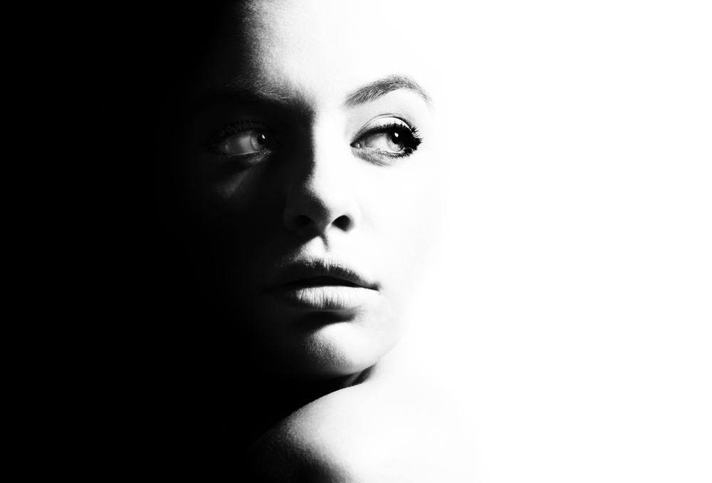
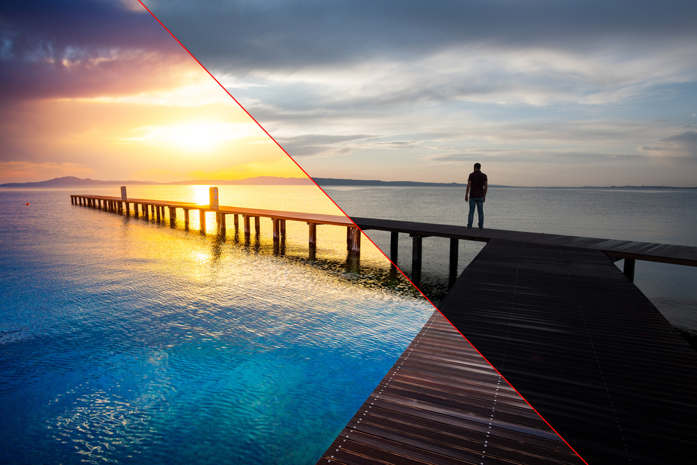
The functionality separates the brightest and darkest areas of the photo or image. Contrast, meaning sharpness, also refers to the sharp an image appears. Increasing the contrast level will result in brighter highlights and darker shadows. While decreasing the contrast will bring the highlights down and the shadows up. If you want the image to pop and look more vibrant, then the contrast should be increased. While doing the opposite will result in a duller-looking image.
Brightness Meaning
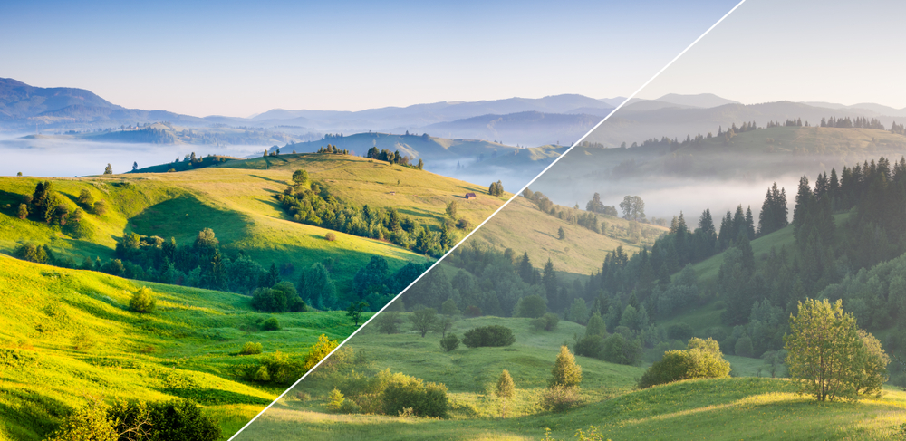
For some, adjusting the brightness level may be a simple task. But, there is more to it than merely increasing or decreasing the brightness of an image. But it is more on brightening the whole image. You adjust the highlights and the shadows of an image on equal terms to achieve a clear photo.
Saturation Meaning
Saturation is somewhat similar to contrast. But, instead of adjusting the separation between highlights and shadows, it separates the colors. Changing the color levels will result in a more noticeable effect on the image colors. It will especially affect the vibrant hues of an image.
How to use the Adjustment tool in Cut Paste Photos App:
The Adjustment tool is in the third stage of editing in Cut and Paste Photos App, here’s how you do it:
- Add an image by:
- Tapping on Take a Picture, if you want a new photo to edit, or;
- Tapping on Choose from Library, to edit an existing image from your gallery.
- Then, crop your image using our specialized crop tools. You can also learn how to use the crop tool like a pro.
- Once you’re happy with the cropped image, tap Next.
- Using the Object tools, make more adjustments to your image by flipping, rotating or even changing its opacity. Then, tap next.
- Once you’re in the photo editing area, find the Adjust tool.
- Tap on the tool and start adjusting your image.
- Increase of decrease the brightness using the toggle bar on the left. Toggle it up to brighten your image. And toggle it down to make it darker.
- The Saturation tool is at the bottom of the screen, toggle it to the right to make the colors go brighter. And toggle the bar to the left to reduce the hue. To make the image black and white, toggle the bar all the way to the left.
- Finally, the Contrast tool is on the right. Adjust the bar up to make the image sharper and brighter. And move the selection bar lower to make the image duller.
- Keep adjusting the three tools until you get your desired result.
- After that, tap on the green check to finish editing.
- A dialogue box will pop up asking you if you want to add animated effects on the image.
- Once finished, save your image. Share your photo on any social media directly through the Cut and Paste Photos App and don’t forget to tag us on your uploaded image!
The contrast, brightness, and saturation features may seem the easiest controls for images. But each one plays different roles which can affect the final result. The features are still intertwined and related to each other. Which is why it is very important to understand their functionalities and know when to use them. Here is a quick guide on how to effectively utilize the contrast meaning, brightness, and saturation features:
To know more on how you can edit videos, you can check this out: How to Adjust Your Video Contrast, Saturation, and Brightness on Mobile?
Tips on how to Use the Adjustment Tools Trifecta (Contrast, Brightness, Saturation)
- Keep in mind that the contrast feature is used to point the attention to image or subject. There are two kinds of contrasts, namely: color and tonal contrast. And it is very important to know how to combine both or to balance them when you use them separately.
- In the Cut and Paste Photos App, the contrast tool uses the tonal contrast. Thus, every time you toggle the bar to adjust, the entire image goes sharper or duller. To keep it even, every time you toggle the contrast bar, you also have to adjust the brightness.
- In other apps that do not have a saturation adjustment, it only has uses a color contrast. So if you use that, it means that you should toggle the brightness to balance the adjustment.
Remember: Keep things simple. Think of the color wheel to make sure that the image colors will complement each other.

- When using the contrast tool, it is best to lightly toggle the bar when editing landscape photos. If you’re editing pictures with a main focal point on a darker or lighter background, then adjust the contrast on high. This helps make the focal point pop out.
- Do not adjust the brightness level way too high unless you want to achieve a washed-out effect on the image. If you are not too sure on which brightness level to use, why not give it a try first and see which one works.
- Saturation creates the depth or intensity of the hues found in an image. If you want to achieve a more vivid image, then the saturation level must be increased. While lowering the level may result in a calming or muting effect.